The visual identity for Aronia is crafted to reflect a fresh, playful, and premium interpretation of Italian gelato culture, blending modern aesthetics with a distinctive and memorable personality.
The logo is built around a bold, custom-styled typographic approach that communicates confidence and brand presence, while the integrated ice cream cone element subtly transforms part of the lettering into a recognizable and engaging symbol. This fusion between typography and icon creates a cohesive mark that is both functional and expressive, allowing the brand to stand out across packaging and digital applications.
Services & Tools
Branding
Illustrator
Mockups
Photoshop
The color palette plays a key role in defining the brand’s character, combining soft lavender tones with vibrant green accents and warm neutral backgrounds. This contrast creates a balance between freshness and sweetness, directly inspired by natural ingredients and fruity flavors, particularly the aronia berry itself. The use of rounded, friendly letterforms further reinforces the approachable and enjoyable nature of the brand, while still maintaining a clean and structured visual system suitable for premium positioning.
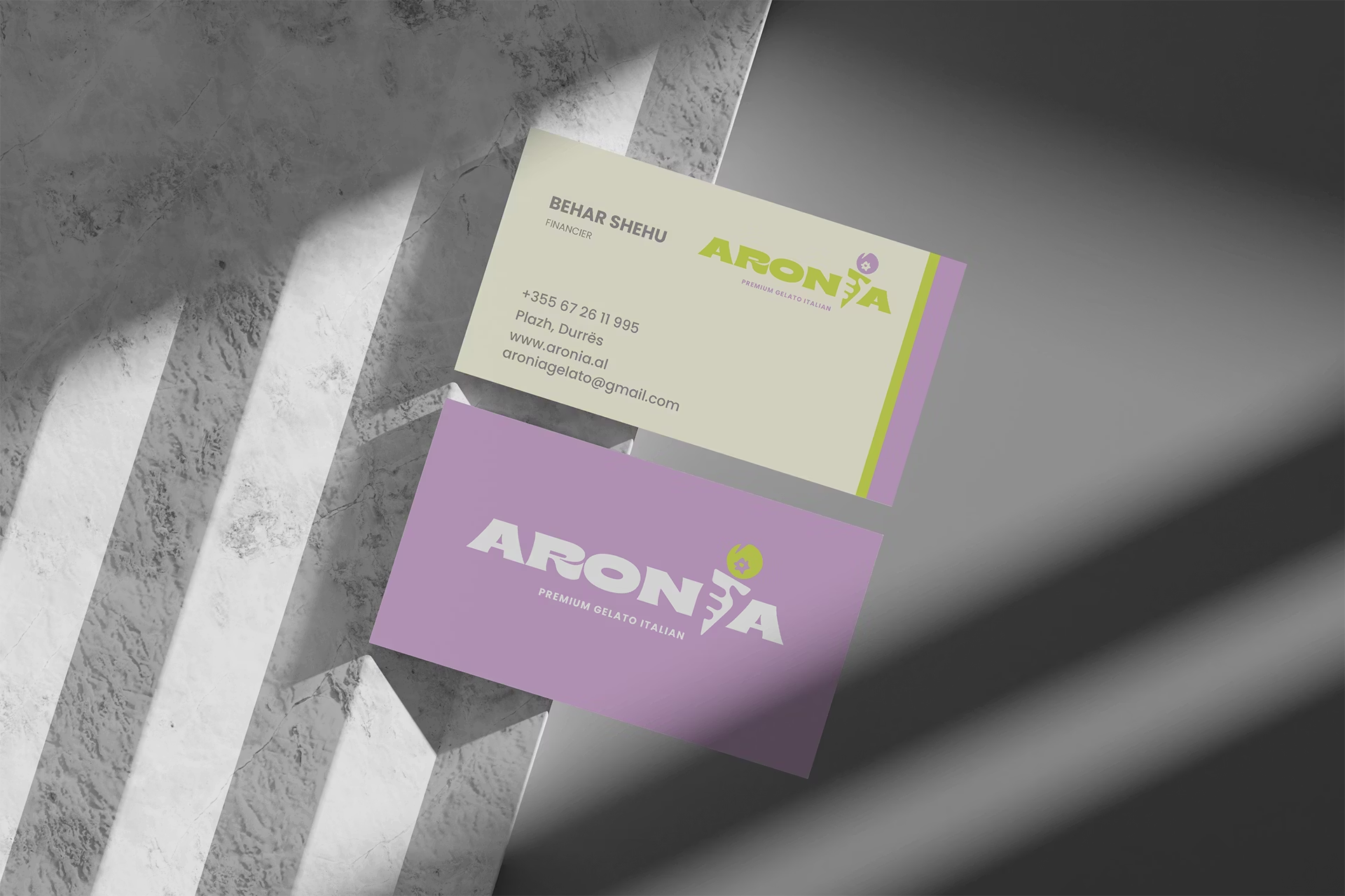
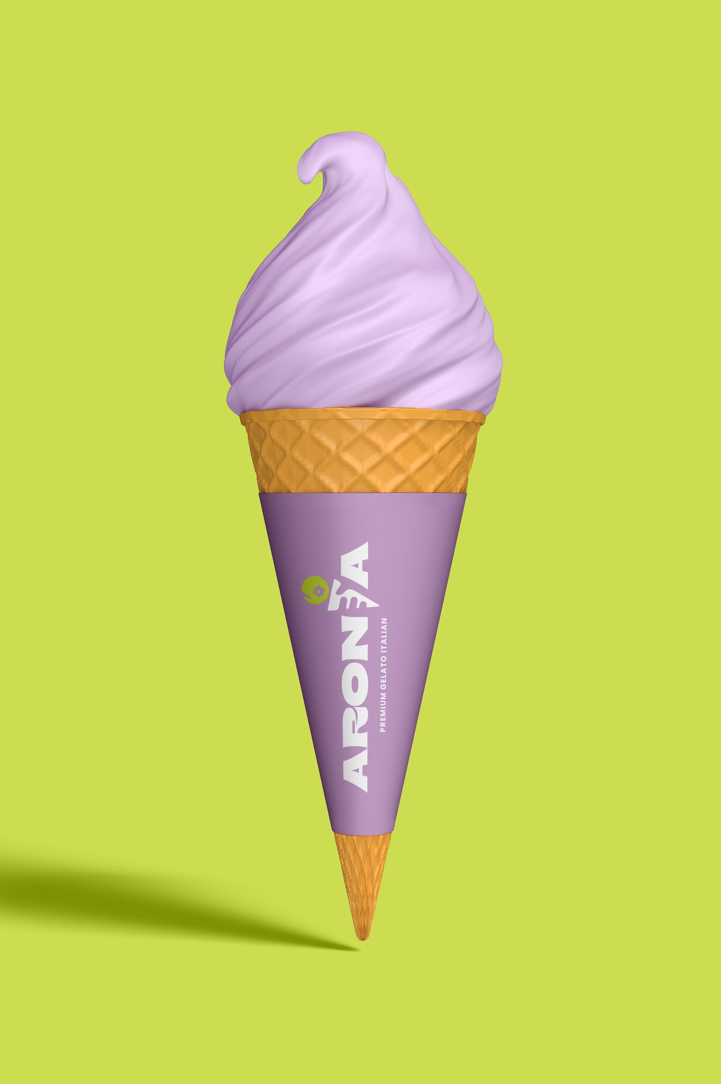
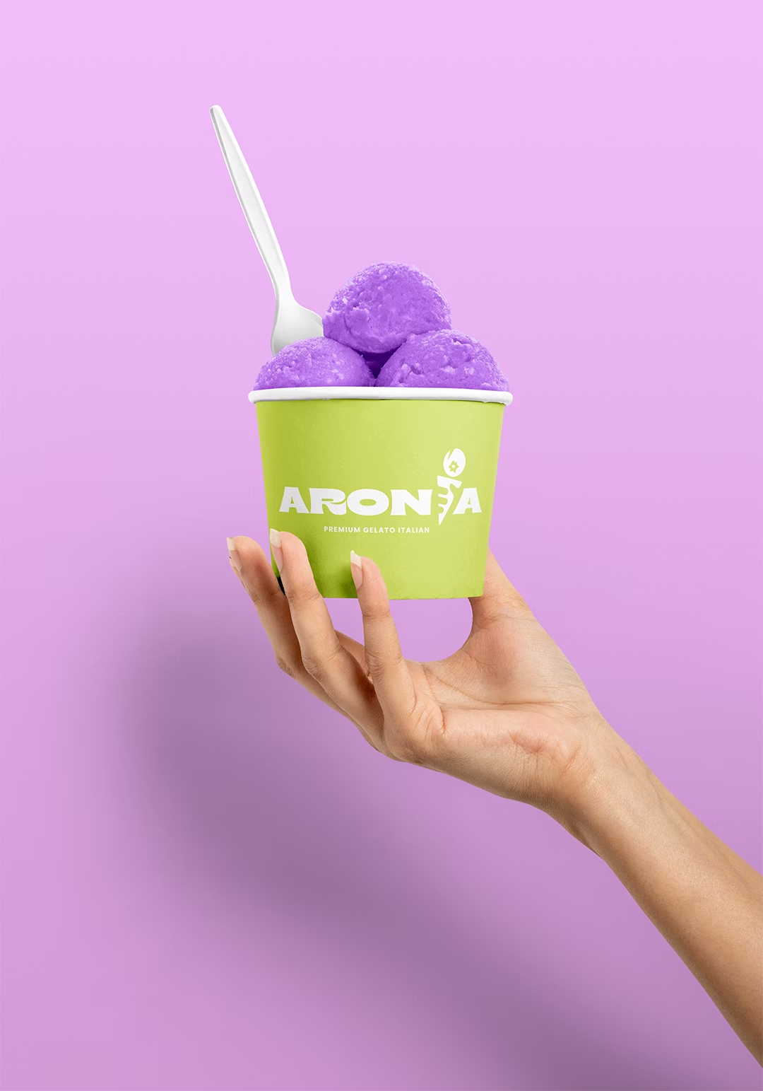
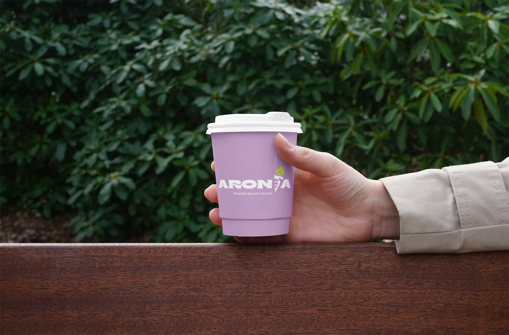
Throughout the design process, the focus was placed on versatility and scalability, ensuring the logo performs consistently across various touchpoints, from cups and packaging to business cards and promotional materials. The result is a cohesive brand identity that feels modern, recognizable, and emotionally engaging, positioning Aronia as a distinctive player in the premium gelato market with a strong visual signature that supports both product appeal and brand storytelling.